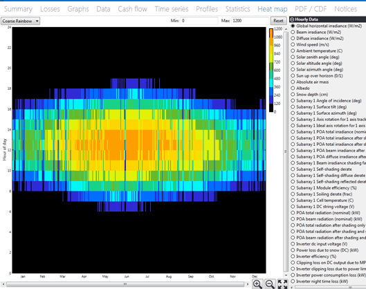
The Heat Map tab allows you to see how the data varies by time of day and by time of year on the same graph. The time of year is on the x axis, and the time of day is on the y axis.
Here are some tips for using the heat map:
•Only one variable at a time can be viewed on the heat map.
•Like the time series graph, the heat map can be scrolled and zoomed. The heat map can zoom in both the x and y directions. You can zoom in both directions at once by highlighting a rectangular region with your mouse. Alternatively, you can use the Ctrl key to zoom in the x direction only.
•The default color map is Coarse Rainbow. The Fine Rainbow color map provides higher color resolution. You can select the color map you want to use in the top left corner.
•Use the Min and Max inputs to set the maximum and minimum bounds for the color map.
•To export an image of the graph or the graph data, right-click the graph (control-click on a mouse with one button) and choose an option.